The slide investors dwell on longest
The competition slide is one of the three pages investors spend the most time on, and one of the last founders take seriously. The study DocSend ran with Tom Eisenmann, professor at Harvard Business School, on seed decks measured what investors actually look at: they spend an average of 3 minutes and 44 seconds on an entire deck, and the pages they study longest are the financials, the team and the competition.
That is the paradox. In a read that lasts under four minutes, the competition slide captures a disproportionate share of attention, and it is almost always the one built last, the night before the meeting, from a 2x2 matrix whose axes were picked so the founder's logo lands alone in the top right. An investor who sees a dozen decks a week spots that construction in three seconds.
This article does not argue about whether you need a competition slide: that debate was settled long ago, it is expected. It covers how to build it. You will find the four available formats with their respective weak points, the method for choosing axes that survive Q&A, how many competitors to include, how to show a barrier rather than a mere difference, and a complete before/after of one slide rebuilt line by line.
What an investor is looking for on this slide
Before choosing a format, you need to know which question the slide answers. It is not "are you better?" An investor knows no founder will ever present a slide concluding that a competitor outperforms them. They are looking for three things, and only one of them concerns your product.
1. That you know your market better than they do. This is the slide's implicit test. The investor has often already seen two or three companies in your sector, sometimes invested in one of them. If your landscape omits a player they know, or files two companies in the same box when they know those companies serve different buyers, the rest of the deck becomes suspect. The competition slide is the only part of the pitch where your claims are immediately verifiable by someone else.
2. That your difference holds over time. An early-stage investor projects three to five years out. They therefore do not read your slide in the present tense but in the future: what is left of that gap when a competitor raises $20M and hires forty engineers? A feature difference does not survive that question. A regulatory position, a network effect or ten years of proprietary data do.
3. That you can say in one sentence why a customer picks you. Not why you are broadly superior: why this customer segment, facing this specific choice, takes you over the alternative. If that sentence does not exist, the slide is only lining up logos.
Keep the formulation those three points lead to: the competition slide is not there to prove you are better, but that you understand the terrain. Almost every construction mistake comes from confusing the two.
The four possible formats
Story Pitch Decks surveyed 25 experts (investors and pitch deck designers) to find out which visual works best on a competition slide. The most useful result of that study is not the ranking, it is the absence of consensus: no format draws clear support, and several respondents insist that what convinces them is not the visual but the market knowledge it reveals.
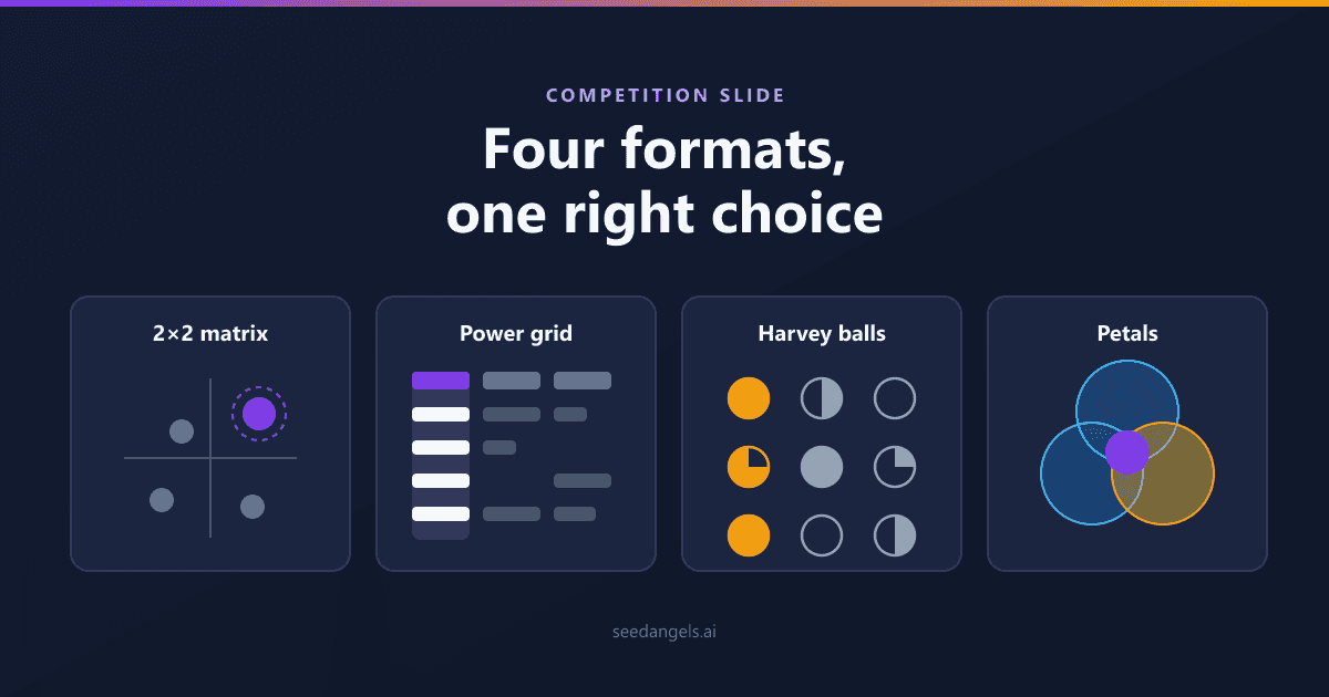
In other words, the format is not what decides how the slide lands. It only decides how fast your message gets across, and what kind of suspicion you attract if the content is thin. Here are the four families, and the trap specific to each.
| Format | When to use it | Its trap |
|---|---|---|
| 2x2 matrix | Two trade-off dimensions that genuinely structure the buyer's decision | Axes picked after the fact to place you alone in the top right |
| Comparison table (power grid) | A purchase decided on several criteria, including non-product ones | Reducing the company to a list of copyable features |
| Harvey balls | A graded position, when no criterion is binary | Drawing yourself as full circles everywhere, which cancels the nuance |
| Petal diagram | You are creating a category rather than entering an existing one | Implying there is no competition where alternatives exist |
The 2x2 matrix
This is the dominant format: 23 of the 25 experts surveyed mention it. It is also the most divisive: 8 speak in favour, 3 against, and 8 stay neutral. That split sums up its risk-reward profile fairly well.
What it does well: deliver an instant read. In under two seconds, the investor sees how many players occupy your zone, who is far from you, and whether the market is crowded. In a deck read that lasts a few minutes, that saving of attention has real value.
Its weakness is structural, and everyone who reads decks knows it: the matrix lends the appearance of rigour to a conclusion decided in advance. Detractors assume, often correctly, that the axes were reverse-engineered to clear the top-right quadrant. The format is therefore not a bad choice; it simply demands axes that survive inspection, which is the subject of the next section.
Use it when: your market genuinely organises around two major trade-offs, and those trade-offs are the customer's, not yours.
The comparison table (power grid)
The power grid puts competitors in columns and benefits in rows. Jack Kaufman of Dreamit Ventures gives a precise construction method: put your company in the left-hand column, then three competitors; in rows, five to ten benefits ranked by importance to the customer.
Three instructions make all the difference between a good power grid and a valueless checkbox chart.
- Quantify instead of qualifying. "Fast setup" means nothing and reads as marketing. "Live in 48 hours versus 6 weeks" is verifiable information, therefore credible.
- Leave cells empty. For a competitor that lacks the benefit, put nothing. A table where every row is filled in for everyone no longer compares anything.
- Do not list only features. The benefits that matter also come from the business model (usage-based billing rather than an annual commitment), distribution (native integration into a tool the customer already uses) and go-to-market (a two-week sales cycle versus six months).
Its weakness, flagged by several experts in the Story Pitch Decks study: the format mechanically pushes you to reduce the company to a list of characteristics, when a characteristic gets copied within a quarter. A power grid made entirely of product rows unintentionally tells the investor that you have no barrier at all.
Use it when: the purchase is decided on several simultaneous criteria and you can put numbers on at least half the rows.
Harvey balls
Harvey balls are those circles filled to varying degrees (empty, quarter, half, three quarters, full) that replace the binary tick in a comparison table. They are the least contested format in the study: 3 favourable opinions, none against.
The reason for that absence of opposition lies in what the format allows. It lets you say "we are at three quarters on this criterion, the leader is at full", and an investor reads that as a realistic view of your position. That nuance is often worth more than superiority claimed everywhere, because it earns you credibility on the rows where you genuinely lead.
The trap is obvious and common: drawing yourself as full circles on every row. You have then paid the format's cost (it is slower to read than a matrix) without getting its benefit, and you have signalled exactly what you were trying to hide. Practical rule: if your column contains no partial circle, change format or change criteria.
Use it when: your advantage is real but graded, and you accept showing two or three rows where you are not first.
The petal diagram and niche formats
The petal diagram places your company at the centre and arranges around it the categories of players you overlap with, each petal carrying two or three logos. It does not compare: it shows that you sit at the intersection of several existing markets.
It is the right format in one case only: when you are creating a category rather than entering an established one, so your competitors are not comparable to each other. An investor reads it as "here are the budgets we take money from", which is useful information.
Its risk: it looks a lot like an elegant way of saying "we have no direct competitors". If you use it, pair it with a sentence naming what the customer does today instead of buying from you. The other niche formats (blue-ocean value curves, single-axis positioning) follow the same logic and are reserved for markets that head-to-head comparison does not describe.
The real subject: choosing your axes
Format choice takes up 90% of the discussion and determines 10% of the outcome. What really decides your slide's value are the comparison criteria: the axes of a matrix, the rows of a power grid. Bad axes ruin any format, and good axes make almost any format acceptable.
The two mistakes that give away a rigged matrix
Mistake 1: choosing the axes after deciding the conclusion. This is the most common working order and the most visible from the outside. The founder knows where they want to appear, then looks for the two dimensions that put them there. The resulting matrix has the appearance of analysis while having decided nothing: it records a pre-existing conviction. The most reliable symptom of that inversion is an axis whose label describes your product rather than a market trade-off ("vertical approach", "built for SMBs").
Mistake 2: axes that produce four equally attractive quadrants. If every box on your matrix represents a defensible strategy, the reader gets a picture, not a recommendation. A useful matrix must make certain positions visibly worse than yours, not because you decreed it, but because the market shows it.
The special case that combines both: the price axis against the quality axis. It appears on one competition slide in three and never informs anything, for a mechanical reason: nobody ever places themselves in the bottom left. No competitor declares itself expensive and bad, so the lower-left quadrant stays empty and the other three fill with undifferentiated players. You end up with a drawing that could illustrate any market.
The three-question test
Before drawing anything, run each candidate axis through these three tests. An axis that fails any of the three should be replaced, no negotiation.
- Does the buyer genuinely trade off on this axis? The question is concrete: in your last sales conversations, did this criterion come up unprompted from the customer? If the axis feels important to you but has never been spoken by a buyer, it is a founder axis, not a market axis.
- Do my competitors spread out along this axis? If every player ends up in the same place on that dimension, it discriminates nothing and does not deserve an axis. An axis that does not spread competitors is a dead axis, even when it matters to the customer.
- If I remove my own company, does the map stay informative? This is the hardest and most revealing test. A good market map would still be publishable in a sector note without your logo on it. If removing yourself drains the matrix of meaning, the axes were built around you.
The example most often cited to illustrate a good choice is the matrix Airbnb used in its early days, reproduced in most guides on the subject: it set offline against online, and expensive against affordable. Both dimensions matched real trade-offs travellers made at the time, existing players genuinely spread across them, and the map stayed readable without Airbnb: the empty space it revealed was a market observation before it was a sales argument.
Do you really have to be alone in the top right
The standard instruction, found in nearly every guide, is simple: place yourself alone in the top-right quadrant, and if competitors crowd your spot, redo the axes. The intent is sound, since a shared quadrant demonstrates no positioning, but applied mechanically it produces exactly the construction investors penalise.
The most useful counterpoint comes from Dreamit Ventures. Faced with a magic quadrant where the founder sits alone in the top right, the question the investor asks is not "what a nice position", but: can your company really only differentiate on two axes? The format carries a limit that works against you: two dimensions is very little to describe defensibility, and an experienced reader knows it.
The two positions are not contradictory once ordered correctly. The top-right quadrant is legitimate when your axes pass the three-question test; it turns against you the moment even one of the three fails. Concretely: redoing the axes because the first set discriminated nothing is analytical work; redoing the axes until you are alone in the top right is stagecraft, and the two only resemble each other on the printed output.
If your valid axes land you in a box shared with a competitor, the right reaction is not to change axes but to change format: a power grid or Harvey balls will say what separates you from that neighbour, where the matrix cannot.
Who to include, and how to name them
Three to five named competitors, no more. Beyond that, two effects compound: the slide becomes physically unreadable in a few seconds of reading, and it signals that you have not settled your positioning: a founder showing twelve competitors is implicitly saying they do not know which ones matter.
Selection follows three rules.
- The ones the investor already knows are mandatory. This is the most expensive point to neglect. Leaving out the most visible player in your market does not make it disappear: it turns your slide into a test you have just failed in front of someone who follows the sector.
- At least one indirect competitor. A company solving the same problem by another means, often with a different model. That is what demonstrates you reason in terms of customer need rather than product category.
- The status quo counts as a competitor. In most early-stage markets, the dominant alternative is not a rival piece of software: it is a spreadsheet, an agency, or doing nothing. Naming it explicitly is often the most credible element on the slide.
On how to cite them: by name, with their logos. Anonymising them as "player A" and "player B" produces the opposite of the intended effect: it suggests you barely know them or would rather avoid the comparison. Stay factual: a visibly hostile comparison always backfires, all the more so because the investor across the table may personally know the founder of the company you are dismissing. Those three to five names are the visible tip of a wider exercise: the competitor mapping in your business plan sweeps every player (direct, indirect and substitute) and tells you which ones earn a place on the slide.
That leaves the most common and most costly reflex: claiming to have no competitors. It is a classic pitch deck mistake that no amount of formatting can fix, because it is about posture before it is about the support: an investor hears either that the market does not exist, or that you have not studied it.
Show what protects you, not just what sets you apart
This is what separates a correct slide from one that moves the deal forward. An advantage sets you apart today; a barrier protects you tomorrow. A feature, a slicker interface, a more aggressive price: all of that gets copied within a quarter or two by a funded team. The investor knows it, and reads your slide asking what will be left of it in three years against a competitor who has raised ten times your round. If no barrier comes to mind at this point, the problem is not the slide: our guide to what separates an advantage from a barrier gives the four-question test and how to build a barrier when you do not yet have one.
Five families of barriers survive that projection.
- Network effects. Product value rises with the number of users. A competitor who copies the product does not copy the installed base: a marketplace with ten thousand active sellers is not caught by shipping the same screens.
- Proprietary data. An asset that accumulates with usage and cannot be bought. Three years of claims, transaction or field-measurement history produce models a new entrant will take three years to match, whatever their resources.
- Switching costs. What it costs the customer to leave: data migration, re-integration into their IT systems, retraining teams, a multi-year contract. A product wired into a company's payroll or accounting is hard to replace, even by something better.
- Regulatory position. An approval, a licence, a certification obtained after eighteen months of review. It is not a product advantage, it is a delay imposed on every new entrant, and it is often the barrier an investor reads most easily.
- Industrial or contractual lead. An exclusive distribution agreement, a patented process, production tooling that is hard to replicate. Its worth lies in its remaining duration: state it.
In practice, a solid competition slide names one primary barrier and one secondary, each with the element proving it already exists, even partially. "Network effects" written alone in a box convinces nobody; "40% of our new sign-ups come from an invitation by an existing user" demonstrates the mechanism.
That defensibility cannot be proven on a single slide: it has to be consistent with your acquisition cost assumptions, your sales cycle and your financial trajectory. That is the underlying work on the whole case, and SeedAngels helps you structure it into a complete business plan (assumptions, forecast and narrative aligned) before you compress it into one slide. Try SeedAngels for free →
The slide by funding stage
The same competition slide does not meet the same expectations at pre-seed and at Series A. The level of proof required rises with every round, and presenting a Series A slide at pre-seed is as counterproductive as the reverse: it is one of the dimensions where what an investor expects at each stage differs most sharply.
At pre-seed, nobody expects a detailed matrix. You have no market share, no win rate, no customer base to compare. What the slide must demonstrate is that you have talked to customers and know what they use today. The most convincing form at this stage is often the simplest: "out of 40 interviews, 25 use spreadsheets, 9 use an agency, 6 use a generalist tool, and here is what they hold against each". That is field information, unavailable in any sector report, and it is exactly what a pre-seed investor is looking for.
At seed, the positioning must be settled and the barrier named. You have a product and first customers: the slide must say who you win, against whom, and why that result is not accidental. This is the stage where the matrix or the power grid comes into its own, provided it is backed by at least one observed element rather than an assumed one.
At Series A, the slide relies on real data. An investor now expects numbers from your CRM: win rate against a named competitor, most frequent loss reasons, churn reasons when you lose a customer to a rival, pricing gaps observed in negotiation. At this stage, a 2x2 matrix with no data behind it reads as a step backwards.
Before / after: one slide rebuilt
Here is the most common case, using a fictional startup selling practice-management software to physiotherapy clinics.
Before. A ten-column table (the startup plus nine competitors) and six feature rows: "scheduling", "invoicing", "insurance claims", "mobile app", "support", "price". The left column shows a green tick on all six rows. The nine competitors have between two and five ticks. Under the table, an arrow announces "positioning: best value for money". The whole thing is set in 9-point type to fit on the slide.
That slide fails on four counts simultaneously: it is unreadable at a glance, it contrasts only copyable features, it claims blanket superiority nobody believes, and its price/quality axis informs nothing.
After. A four-column power grid: the startup, the two most widely installed tools among physiotherapists, and "spreadsheet + paper diary", the status quo, which still equips the majority of practices with fewer than three practitioners. Six rows, ranked by the importance customers stated in interviews: setup time, claims compliance, locum management, monthly cost per practitioner, weekly data-entry time, data portability. The cells carry numbers: "2 hours versus 3 weeks", "4 hours a week saved", "$39 per practitioner versus $75". Three cells in the startup column are empty or partial, including the mobile app. Under the table, a single line: "we win 7 out of 10 deals against the status quo, 3 out of 10 against the leader".
The changes and their rationale:
- Ten competitors cut to three, plus the status quo. The table becomes readable again, and the status quo, the genuinely dominant alternative in this market, finally appears.
- Features replaced by ranked benefits. Rows are ordered by what customers cited in interviews, not by the product roadmap.
- Ticks replaced by numbers. "2 hours versus 3 weeks" is verifiable; a green tick is not.
- Three cells owned as weak. They make the others credible. That is the central mechanism of the rebuilt slide.
- Two non-product rows added (cost per practitioner and data portability), which belong to the business model rather than the feature set, and are therefore harder to copy.
- The price/quality axis replaced by an observed win rate. A number from the CRM replaces a self-assessment.
Before you present your rebuilt version, have it reviewed: our Pitch Deck Analyzer goes through your deck slide by slide and flags the points an investor will raise first, including the consistency of your competitive positioning.
Where the slide belongs and how to defend it live
The competition slide goes after the problem, the solution, the market and traction, right before the team, around slide eight or nine. That order follows an investor's reading logic: they must understand the need, your answer and its market size before they can assess your relative position. Placed too early, the slide arrives before the stakes have been set and reads as a list of logos without context.
This is not an absolute rule but a solid convention, consistent with the full structure of a pitch deck as most funds expect it. Two adjustments are accepted: if your market is already very crowded and the investor knows it, moving the slide up right after the solution defuses the objection before it forms; if your differentiation rests entirely on a technical barrier, it gains from sitting just after the product slide.
That leaves the part almost no guide covers: this is the slide that triggers questions. Three come up systematically in Q&A.
- "What if [big incumbent] decides to do the same thing?" The bad answer explains that it would be too complicated for them. The good one rests on incentives: this market represents a negligible fraction of their revenue, it conflicts with their current model, or it would require a sales organisation they do not have. Add what would buy you time if they did move in anyway: your data lead, your contracts in place.
- "Why hasn't this competitor already won?" This is a question about the market, not about you. Answer with what changed recently to open the window: a regulatory shift, a drop in technology cost, a change in usage. If nothing has changed, the investor will conclude the seat is taken.
- "What protects you?" This is the direct restatement of the previous section. Name one barrier, only one, and give the proof that it is already under construction. An honest answer like "today, our only barrier is execution speed, and here is how we are building the network effect" beats a list of five theoretical protections.
Live, the rule that simplifies everything: do not read your slide, comment on it with one positioning sentence, then let the questions come. The slide is a support for the discussion, not a script.
Competition slide examples
Here is the competition slide as it appears in our free pitch deck examples. First the alternatives table, naming each competitor with its strengths and weaknesses (Editorial design, SaaS startup):
Then the positioning map, on two axes chosen to show the space the project holds alone (Signal design):
The same logic works outside software: a restaurant names the shops on its block, a hotel the properties in its town.
Conclusion
You do not win the competition slide by appearing better. You win it by showing that you understood the terrain before the investor did, that you know who really matters in your market, what the customer trades off on, and what will still be true of your advantage in three years.
Everything else follows. The format is only a vehicle: choose it based on how your customer decides, not on which one flatters you most. The axes, on the other hand, deserve the time you are probably not giving them: they, not the drawing, make the difference between analysis and stagecraft. And if your honest position is not alone in the top right, say so: a slide that owns two weaknesses makes the five strengths around them credible.
One last point, often forgotten: this slide has to be consistent with the rest of your case. The barriers you announce must show up in your acquisition cost assumptions, your sales cycle and your margins. SeedAngels builds that case end to end, from business plan to financial forecast, so your competition slide says the same thing as your numbers. Try SeedAngels for free →
FAQ
Which format should you choose for a competition slide?
No format has investor consensus. The 2x2 matrix remains the most widely used and offers the fastest read, but it is also the most suspected of axis manipulation. A comparison table convinces in markets where buyers weigh several criteria at once. Harvey balls allow nuance. Choose based on how your customer actually makes trade-offs.
How do you choose the axes of a competitive matrix?
Apply three tests. Does the buyer genuinely trade off on this axis, or is it you who considers it important? Do your competitors spread out along this axis, or are they all clustered together? Does the map stay informative if you remove your own company? If an axis fails any of the three, change it. Avoid the price/quality pair, where nobody ever sits at the bottom.
How many competitors should appear on the slide?
Three to five, named. Beyond that, the slide becomes unreadable and suggests you have not settled your positioning. You must include the ones the investor already knows: their absence is noticed immediately. Add at least one indirect competitor and mention the status quo, meaning what the customer does today instead of buying from you.
Where should the competition slide go in a pitch deck?
After problem, solution, market and traction, right before the team, in practice around slide eight or nine. That order follows the reading logic: the investor must understand the need and your answer before evaluating your position against others. A competition slide placed too early arrives before the stakes have been set.
Should you name your competitors?
Yes. Competitors anonymised as "player A" and "player B" suggest that you barely know them or that you are avoiding them. Name them, use their logos, and stay factual: a hostile or visibly biased comparison backfires, especially if the investor personally knows the company you are dismissing.
How do you present competition at pre-seed, with no finished product?
Show market knowledge rather than a feature comparison you cannot yet make. Describe what your potential customers use today, with proportions drawn from your interviews, and why those solutions leave them dissatisfied. At this stage an investor is looking for proof that you have talked to the market, not a sophisticated matrix.
What actually protects a startup from competitors?
Not features: they get copied within months. Real barriers are structural: network effects, accumulated proprietary data, high switching costs for the customer, exclusivity contracts, regulatory approval, or an industrial lead that is hard to close. An investor reads your slide asking what will still be true in three years against a well-funded competitor.